Information Elements
Tooltip
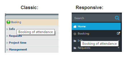
Small information message for the user that appears on hover over the
particular item.
Does the particular item have the tooltip or not is identified in the
description for a particular action.
Photo tooltip
The specific type of the tooltip: the tooltip appears when hovering over a
person. It consists of the person's photo (profile picture), person's contact
details and person's organisation unit.
Popover
Popover is a small help message for the user which appears when user clicks
on the "?" (question mark symbol) next to the field.
Help message
There are several types of the help messages:
-
help message for the whole page:
it is as a small "!" sign in the application header next to the system menu.
Clicking on the sign redirects the user to the help page opened in the separate
browser-tab;
-
help message for the particular form:
The help message belongs to the form and contains the useful information about
the form user is going to fill out.
-
help for a particular field in the form
(see popover)
help message for the whole page:
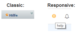 help message for the particular form:
Notifications
Notifications are small blocks of information that belong to a specific page
or to a specific user action.
There are different types of notifications:
-
error notifications:
is a warning message that notifies the user that something goes not as expected
-
error notification with exception:
Warning message with additional link to the exception.
-
-
successful notifications:
is a notification that informs the user that the action was successfully
performed.
-
information notifications:
message that contains additional useful information for the user for a
particular action or triggered event.
-
hidden info notifications:
Information notifications that are not shown on the page but in the header
instead in order not to confuse the user (not to distract them from the main
workflow).
-
-
System messages:
informational messages created by system administrator. They are shown
on the Home page.


 help message for the particular form: