Data representation elements
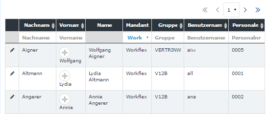
Datatable Classic:
Datatable Responsive small Window:

Simple Table:
| Vergrößern |
Table
There are several types of the tables in Webdesk application.
Simple data lists are the tables with extended possibilities. Simple data list (SDL) is characterised by having a search row (for faster search of the data in the table), sorting options, paginator and an additional action column (usually the first column with the icon which identifies what action can be performed for the table row).
Another type of the tables used is simple tables. They are the ordinary tables (no specific funcionality is present).
Pagination
Pagination is used for dividing the data into smaller parts.
One can choose the number of the table rows (lines) to be displayed on the page.
Pagination consists of :
- informational label: identifies how many entries are displayed currently on the page of the total number of lines;
- input field: provides the ability to change quickly the amount of entries to be displayed on the page;
- pager: provides ability to navigate quickly to the desired page (link or the dropdown), go one page back / further, go the the first / last page (controlled by the arrows).
One can found this type of pagination, for example, in the simple data lists.
Tree
| Vergrößern |
Tree elements are commonly used to represent a hierarchical view of information.
For example, the organigramm of the client is a tree built from orgunits; client's menu tree is a tree built from the menu items.
Tree always has a root: the top-level element in the hierarchy. The elements of the tree situated on the lowest levels (have no children) are called leaves.
Tabs and subtabs
| Classic: | Responsive: |
 |
 |
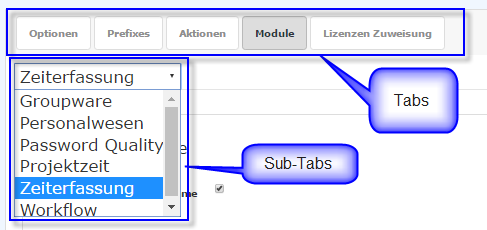
UI elements that are used for better organisation (grouping) of the information within a page.
The tab that is embedded into another tab is called a subtab.
Panel
| Classic: | Responsive: | ||||
|
|
The container element used for grouping different UI elements. In Webdesk is used as the container or a set of containers inside the working area (user's desktop area).
Collapse area
| Classic: | Responsive: | ||||
|
|
Collapse area is the container element (contains sets of different UI elements within the page, form, tab, sub-tab) that can be collapsed or expanded (depending on the previous state) by clicking on the corresponding button.
Keine Kommentare vorhanden.